|
|
Editorial
|
Dear IAnDians,
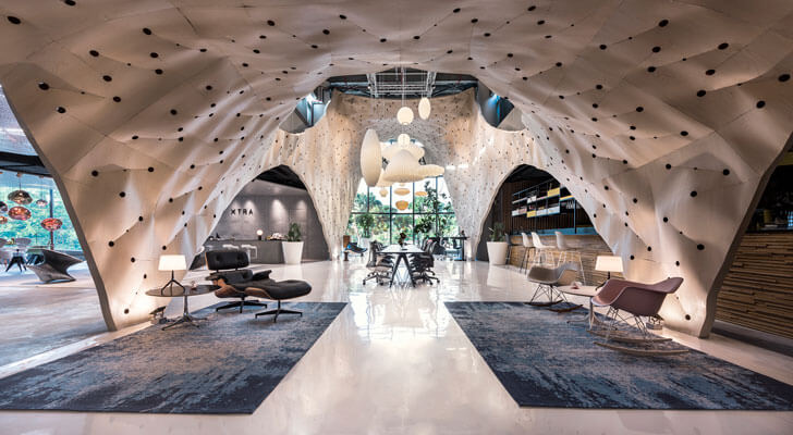
The quest for something more drives design; an insatiable thirst that revels in the exploration of material, form, experiences. The Herman Miller display at the Xtra store in Singapore by Produce.Workshop applies the tenets of an installation to enliven the store interior. This winner of the World Interior for the year 2017 stands out for its juxtaposition of the colloquial with the chic: the structure is made to resemble a bazaar to create a makeshift marketplace with an approachable and casual atmosphere.
This is perhaps the crux of what clicks of late. Each one wants engagement... interaction. Whilst some want to engage with their immediate surrounds, others look deeper at the experience. It is not at all about the cover; it is about what's inside.
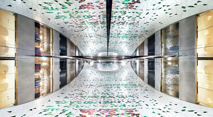
Taking a cue from this premise is the new veil-like atrium at Printemps, Paris. Check this out for yourself. It's a beautifully designed piece of scenography that dynamically interacts with the store visitors.
And of course, there's much more...
Enjoy your read
Warmly,
Savitha Hira
Editor
|
|
sponsored
|

|
|
|
|
INDITERRAIN
|
|
|
|
|
|
|
|
global hop
|
|
|
|
| Projects
|
| Printemps’ dynamic new atrium!
|
| Printemps, the historic department store on Boulevard Haussmann in Paris, France, gets a makeover with a stunning atrium that stretches vertically from the lower ground floor up to the 9th floor…
|
| Read more
|
|
|
|
|
|
|
|
|
|
|
|
|
|
|
product hub
|
|
|
|
|
|
|
|
|
|
|
|
To read what some of our readers-patrons have to say about us: click here
Team India Art n Design looks forward to hear from you too and add your valueable opinion to our long list of satisfied readers. To send us an email :click here
|
| Copyright Pink Daffodils 2017
|
|
|
|
|
|
|
|
|






No comments :
Post a Comment